Photography Portfolio Redesign
Timeline: 2 Weeks, Role : Idea, UX Designer, UI Designer
Overview
Portfolios showcase both the photographer and their work; it should house a collection of photos that demonstrate the photographer's creativity and professionalism. They’re sent to potential clients and employers in hopes of receiving work, so they have to be an exceptional example of the photographers talent.
Problem Statement
Student portfolios are often generic and lack purpose. I was tasked to redesign my client’s student portfolio with the user in mind in order to increase the usability of their website, and increase their chances of a being hired.
Project Goals
- Display photos in an organized and clear way.
- Maintain professionalism in UI.
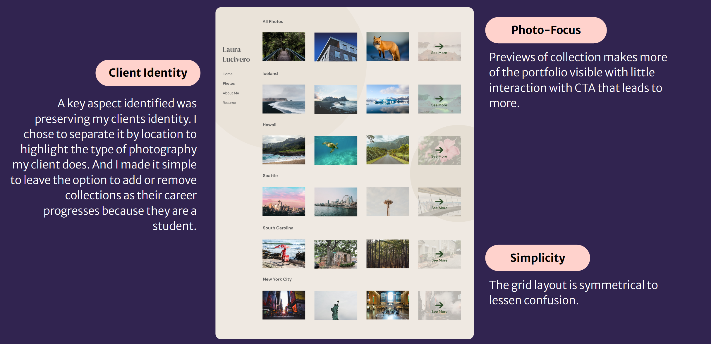
- Maintain client’s identity/brand throughout the design.
Design Process
- Discovery
- Client Interview
- User Interview
- Secondary Research
- Current Website Analysis
- Define
- Analyze data and identify problems and goals
- Create design solutions
- Ideate
- Wireframes
- Style Guides
- High Fidelity Prototype
- Test and Conclude
- User Feedback
- Future Plans
Discovery
To begin my discovery phase I created research questions to guide this first stage.
Research Questions:
- What are the essential aspects of a student portfolio?
- How do we best implement the essence of the photographer into the design?
User Interview
I began with interviewing a demographic of potential users. The website's audience comprises professionals within the photography industry who are either seeking to hire photographers or evaluating my client's photography portfolio. I chose my demographic for my interview to reflect the website’s visitors and interviewed two consultants and a professor of photography.
Insights
- Organization and Simplicity are the most valued qualities of a portfolio
- Photo Focused
- Intentional Selection
- “Let your goals shape your portfolio”
Client Interview
After consulting with professionals, it's widely recognized that a portfolio serves not only as a showcase for photographs but also as a platform to present the photographer themselves. In light of this perspective, I made a deliberate choice to conduct interviews with my client as well. This approach ensured a comprehensive understanding and representation of both the photography work and the photographer's identity.
I conducted an interview with my client to ensure that the design of the website truly captures their personal elements. This approach was aimed at enhancing the overall authenticity of the website.
Insights
- Client's preference for a modern design over traditional
- Requirement for an adaptable design to accommodate future updates as their career progresses
- Emphasis on maintaining the client's identity throughout the design
- Client is a Student
- Client is also a Landscape Photographer
Secondary Research: Competitive Anaylyis
Finally, I extensively reviewed various other portfolios. This step was taken to create a sense of familiarity for users, as they regularly engage with portfolios in their daily lives. It's worth noting that a consistent experience across portfolios tends to result in an enhanced user experience. My objectives for this research were:
- Identify commonly used features
- Understand costs and benefits of different photo layouts
Insights
- The arrangement of a portfolio is closely tied to the type of photos it showcases. For example, landscape shots may benefit from spacious layouts that capture wide vistas, while portrait photos might focus on close-up details and emotional expressions. Matching the layout to the photo type maximizes the visual impact and engages the audience more effectively.
- At least 2 images are on the home page of portfolios, common practice is the use of Hero Images
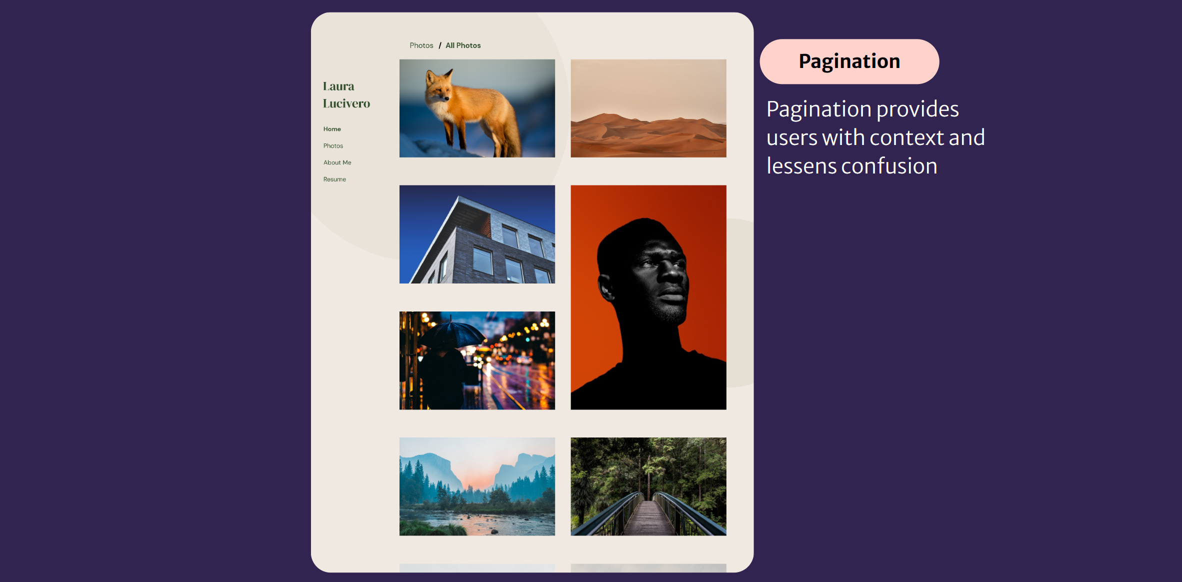
- Pagination is always present and helpful for users to navigate the website more effectively
Current Website Analysis
To initiate the design process, I began by analyzing the current portfolio website. This allowed me to understand its existing style and pinpoint areas that could be enhanced to better cater to user requirements.
During this assessment, I identified a number of noteworthy concerns specifically on the homepage. These issues have the potential to deter users from engaging with the website effectively. They encompass:
Confusing Navigation May Lower Interaction
The navigation is hidden and the user can only see both the different pages and labels for the photos while hovering. The overlapping menu looks unprofessional and doesn’t reflect well on the client.
Distracting Interface Detracts From Photos
The image background creates distractions from the photos, shifting the focus away from them. This design also makes it challenging to read the menu. Furthermore, the photo grid displays inconsistent dimensions.
Define
I gathered research and found out what's working and not working on the current website. With that knowledge, I designed solutions to make the user experience better.
| Key Takeaway/Problem | Design Solution |
|---|---|
| The essential considerations for designing a student portfolio include organization and simplicity as crucial values. The portfolio should be centered around visual content, particularly photographs, while aligning with the intended goals. | I opted for a simple grid layout as a strategic choice. This layout effectively promotes clarity and showcases visual content, while also allowing customization to resonate with the portfolio's specific objectives. |
| The client interview highlighted the need to balance the client's aversion to traditional design with the user's preference for simplicity. | In order to balance the needs of the client and user I opted for a subdued natural color palette. This choice was made to ensure that the color scheme aligns with their resume, thus preserving their brand identity while fostering a deliberate and cohesive visual experience. |
| The research identified that portfolio layouts significantly vary based on the type of photos, with specific attention to Landscape vs Portraits. Additionally, common practices include having a minimum of 2 images on the homepage, featuring Hero Images, and implementing pagination for improved user navigation. | User experience improves when a website aligns with user expectations. To address this, I adhered to fundamental portfolio mechanics and integrated prevalent features: a grid layout for visual coherence, pagination for easy navigation, and endless scrolling. With these components, the design ensures a familiar and user-friendly interface that caters to visitors' expectations. |
Ideate
Wireframes
Combining all my design solutions, I created wireframes as a blueprint for my final design.
Style Guide
Colors
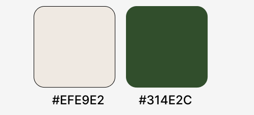
The color scheme for the website harmoniously aligns with my client's resume, ensuring a seamless visual connection between the two elements. By opting for neutral colors, I've made certain that the website's aesthetic doesn't overshadow the photographs while upholding a consistent and professional theme throughout. The neutral tones strike a balance, allowing the imagery to be higlighted while maintaining a refined and cohesive overall appearance.
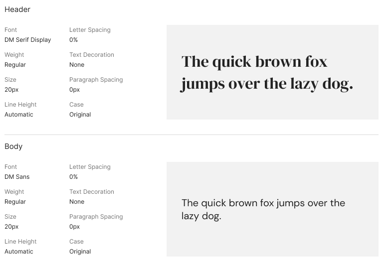
Font
DM Serif Display was used as a header to create a sense of class and sophistication that aligns seamlessly with the client's persona and their desire to convey that essence within the portfolio. This font selection adds an elegant touch to the design, enhancing the overall visual appeal. For readability and consistency, I opted for DM Sans in the body text. This choice ensures that the content remains accessible and easily digestible for users while maintaining a cohesive design aesthetic. By thoughtfully balancing the client's preference for style and the user's need for clarity and coherence, I've achieved a harmonious blend that caters to both aspects, enhancing the overall quality of the website.
High Fidelity Prototypes
Figma Prototype Here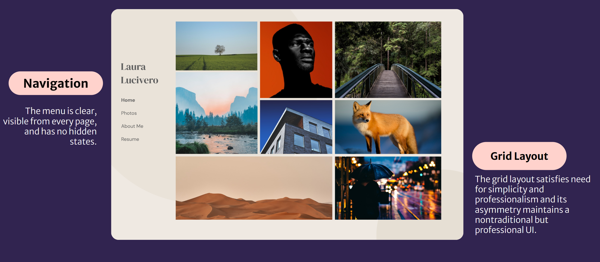
Test and Conclude
Thoughts
I think that there were a lot of different ways to handle this problem, and I am happy with the route I took. Though I know there are places to improve, that only motivates me.
Challenges
A challenge I had was validating my UI choices. I felt confident in my layout but making sure their was intent in the styles and fonts and other more UI features was different than I am used to.
Next Steps
My next steps would be to do some user tests and get genuine feedback. I would also want to know if there was any increase in contact with my client.